Tutorial for the Magnum UI library
Get started with the Ui library using a bootstrap project.
This tutorial builds upon the base Getting Started Guide, with a focus on setting up and using the Ui library to create a simple user interface. You're encouraged to go through that one first if you haven't already.
1. Download the bootstrap project
In the ui branch of the bootstrap repository is a minimal setup for a UI application. Download the branch as an archive and extract it somewhere:
1a. Option A: add dependencies as CMake subprojects
The UI library is located in the Magnum Extras repository and additionally relies on font and image loading plugins to be able to draw text and icons. Like before, the easiest way without having to install anything is adding those as CMake subprojects, for an alternative, see 1b. Option B: install Magnum separately and let CMake find it below. Clone the relevant repositories like this (or use git submodule add, if you already have a Git repository):
cd /path/to/the/extracted/bootstrap/project
git clone https://github.com/mosra/corrade.git
git clone https://github.com/mosra/magnum.git
git clone https://github.com/mosra/magnum-plugins.git
git clone https://github.com/mosra/magnum-extras.git
Then open the CMakeLists.txt file in the root of the bootstrap project and add the new subdirectories using add_subdirectory() so the file looks like below. The EXCLUDE_FROM_ALL arguments ensure only the parts you actually use are built (and excludes the subdirectories from the install target as well), and the final add_dependencies() call makes sure that by the time your executable is built, the plugins it dynamically loads are ready as well:
cmake_minimum_required(VERSION 3.5...3.10)
project(MyApplication)

set(CMAKE_MODULE_PATH "${PROJECT_SOURCE_DIR}/modules/" ${CMAKE_MODULE_PATH})

# Add Corrade and Magnum as subprojects, enable the application, required
# plugins and the UI library itself
add_subdirectory(corrade EXCLUDE_FROM_ALL)
add_subdirectory(magnum EXCLUDE_FROM_ALL)
add_subdirectory(magnum-plugins EXCLUDE_FROM_ALL)
add_subdirectory(magnum-extras EXCLUDE_FROM_ALL)
set(MAGNUM_WITH_SDL2APPLICATION ON CACHE BOOL "" FORCE)
set(MAGNUM_WITH_STBIMAGEIMPORTER ON CACHE BOOL "" FORCE)
set(MAGNUM_WITH_STBTRUETYPEFONT ON CACHE BOOL "" FORCE)
set(MAGNUM_WITH_UI ON CACHE BOOL "" FORCE)

add_subdirectory(src)

# And make sure the plugins get built as dependencies of the main executable
add_dependencies(MyApplication Magnum::StbTrueTypeFont Magnum::StbImageImporter)
The above doesn't rely on any additional dependencies besides SDL2, which you should already have set up from the base Getting Started Guide. Check it for more information if you want to have it as a CMake subproject as well.
1b. Option B: install Magnum separately and let CMake find it
You likely already have Magnum packages ready for your platform:
- ArchLinux packages
- Packages for Debian, Ubuntu and derivatives
- Packages for Fedora, openSUSE and other RPM-based Linux distributions
- Homebrew formulas for macOS
- Gentoo Linux ebuilds
- MSYS2 packages
- CMake Package Manager / CPM
- Vcpkg package
Note that besides corrade and magnum you'll need also the magnum-plugins and magnum-extras packages. Everything the UI library relies on is included in the default set of libraries enabled by all packages.
If you cannot use a package, follow the manual building guide for Corrade, Magnum, Magnum Plugins and Magnum Extras to build & install everything. Enable MAGNUM_WITH_SDL2APPLICATION for Magnum, MAGNUM_WITH_STBIMAGEIMPORTER and MAGNUM_WITH_STBTRUETYPEFONT for Magnum Plugins, and MAGNUM_WITH_UI for Magnum Extras.
Once you install everything, you don't need to edit the bootstrap project CMakeLists.txt in any way, worst case you may have to pass CMAKE_PREFIX_PATH to CMake if you installed the dependencies to a non-standard location.
2. Review project structure
Compared to the base bootstrap project used in the Getting Started Guide, there's just one extra file, modules/FindMagnumExtras.cmake, which takes care of finding the UI library. But again there's no need to pay attention to contents of the modules/ directory, its main purpose is to make the initial CMake experience better.
The src/CMakeLists.txt file contains additional bits for finding & linking the UI library, other than that it's the same as before. The font and image plugins are loaded dynamically at runtime and thus don't require any CMake setup:
find_package(Magnum REQUIRED Sdl2Application)
find_package(MagnumExtras REQUIRED Ui)

set_directory_properties(PROPERTIES CORRADE_USE_PEDANTIC_FLAGS ON)

add_executable(MyApplication MyApplication.cpp)
target_link_libraries(MyApplication PRIVATE
    Magnum::Application
    Magnum::Magnum
    MagnumExtras::Ui)
All scaffolding for the UI library is then inside MyApplication.cpp. The application class has a Ui::
#include <Magnum/Platform/Sdl2Application.h>
#include <Magnum/Ui/UserInterfaceGL.h>

using namespace Magnum;

namespace {

class MyApplication: public Platform::Application {
    public:
        explicit MyApplication(const Arguments& arguments);

    private:
        void viewportEvent(ViewportEvent& event) override;
        void drawEvent() override;
        void pointerPressEvent(PointerEvent& event) override;
        void pointerReleaseEvent(PointerEvent& event) override;
        void pointerMoveEvent(PointerMoveEvent& event) override;
        void scrollEvent(ScrollEvent& event) override;
        void keyPressEvent(KeyEvent& event) override;
        void keyReleaseEvent(KeyEvent& event) override;
        void textInputEvent(TextInputEvent& event) override;

        Ui::UserInterfaceGL _ui;
};

…

}

MAGNUM_APPLICATION_MAIN(MyApplication)
The application sets up a resizable window and the builtin Ui::now() function that's subsequently passed around. The viewportEvent() propagates window size changes to the UI, drawEvent() takes care of UI animations and redrawing, and the pointerPressEvent() and all other event implementations just proxy the events to the UI without doing anything else.
#include <Magnum/GL/DefaultFramebuffer.h>
#include <Magnum/GL/Renderer.h>
#include <Magnum/Math/TimeStl.h>
#include <Magnum/Ui/Application.h>
#include <Magnum/Ui/Theme.h>

…

Nanoseconds now() {
    return Nanoseconds{std::chrono::steady_clock::now()};
}

MyApplication::MyApplication(const Arguments& arguments):
    Platform::Application{arguments, Configuration{}
        .addWindowFlags(Configuration::WindowFlag::Resizable)},
    _ui{*this, Ui::DarkTheme{Ui::DarkTheme::Feature::Animations}}
{
    /* UI requires premultiplied alpha */
    GL::Renderer::setBlendFunction(GL::Renderer::BlendFunction::One,
                                   GL::Renderer::BlendFunction::OneMinusSourceAlpha);

    /* TODO: Add your UI and other initialization code here */
}

void MyApplication::viewportEvent(ViewportEvent& event) {
    GL::defaultFramebuffer.setViewport({{}, event.framebufferSize()});

    _ui.setSize(event);
}

void MyApplication::drawEvent() {
    GL::defaultFramebuffer.clear(GL::FramebufferClear::Color);

    /* TODO: Add your other drawing code here, if any */

    _ui
        .advanceAnimations(now())
        .draw();

    swapBuffers();
    if(_ui.state())
        redraw();
}

void MyApplication::pointerPressEvent(PointerEvent& event) {
    _ui.pointerPressEvent(event, now());

    if(_ui.state())
        redraw();
}

…
3. Build & run the project
To verify the initial setup, let's build and run the project first. The build workflow is no different from the base Getting Started Guide:
- If you went with the CMake subproject approach (Option A above), the project is configured to place all binaries into a common location, the application will be placed in
Debug/bin/MyApplication(on Windows along with all DLLs it needs), and plugins that the UI library automatically loads will be inDebug/lib/magnum-d(orDebug/bin/magnum-don Windows). - If you went with Option B, externally installed Magnum, the executable gets placed into its default location in
src/MyApplication, and libraries and plugins get loaded automatically from where CMake found them, worst case on Windows you may need to adjust%PATH%.
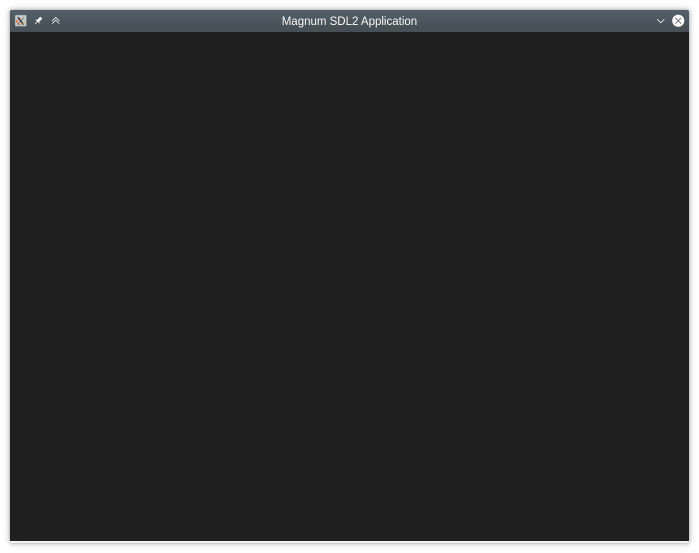
If everything goes well, you should end up with a completely blank window like above. The UI is there, all ready, but so far contains nothing. Let's fix that now.
Your first button
The most essential interactive piece of a UI is usually a button. Here it's exposed as a Ui::_button member and initialize it in the application constructor using a Ui::
…
#include <Magnum/Ui/Anchor.h>
#include <Magnum/Ui/Button.h>

class MyApplication: public Platform::Application {
    …
    private:
        Ui::UserInterfaceGL _ui;
        Ui::Button _button;
};

MyApplication::MyApplication(const Arguments& arguments):
    …
    _button{Ui::Anchor{_ui, (_ui.size() - Vector2{100, 40})*0.5f, {100, 40}},
        "Hello!", Ui::ButtonStyle::Success}
{
    …
The Ui::{100, 40} and place it in the center of the window. When you build and open the application again, you'll be greeted by a button looking like this, just interactive, reacting to hover and press:

To make the button do something when clicked, we'll pass a lambda to Ui::#include it to have the lambda properly recognized. Here we'll make the button just switch the style between a green and a red one:
#include <Corrade/Containers/Function.h>

…

    _button.onTrigger([this] {
        _button.setStyle(_button.style() == Ui::ButtonStyle::Success ?
            Ui::ButtonStyle::Danger : Ui::ButtonStyle::Success);
    });
}
Deferring widget member creation
Having to set up widgets inside the application constructor initializer list, like shown above, is rather limiting and quickly becomes a burden. A common pattern is to instead initialize the widget members using the NoCreate tag (i.e., here with the Ui::
class MyApplication: public Platform::Application {
    …
    private:
        Ui::UserInterfaceGL _ui;
        Ui::Button _button{NoCreate};
};

MyApplication::MyApplication(const Arguments& arguments): … {
    …

    _button = Ui::Button{
        Ui::Anchor{_ui, (_ui.size() - Vector2{100, 40})*0.5f, {100, 40}},
        "Hello!", Ui::ButtonStyle::Success};
}
Automatic widget position and size
Finally, while it's possible to have the UI built with hardcoded widget positions and sizes, commonly the widgets are organized in a layout hierarchy that takes care of this automatically. First, let's use a layout just for the lone button — we'll use Ui::
#include <Magnum/Ui/SnapLayout.h>

…

MyApplication::MyApplication(const Arguments& arguments): … {
    …

    _button = Ui::Button{
        Ui::SnapLayout::snapRoot(_ui, Ui::Snaps{}),
        "Hello!", Ui::ButtonStyle::Success};
}
The function takes an optional size argument as well, but here we omit it, making the layout pick a size on its own — the theme specifies all sizing and spacing, and the button is additionally made large enough to fit its label. Additionally, compared to manual placement, the widget now also stays in the center when the window gets resized:

Widget layouts
Now let's finally move on to something non-trivial. A login wall is easily among the most loved UI patterns, so let's create one. In addition to a button we'll need a bunch of Ui::
#include <Magnum/Ui/Input.h>
#include <Magnum/Ui/Label.h>

class MyApplication: public Platform::Application {
    …
    private:
        …
        Ui::Label _titleLabel{NoCreate},
            _usernameLabel{NoCreate},
            _passwordLabel{NoCreate};
        Ui::Input _username{NoCreate};
        Ui::PasswordInput _password{NoCreate};
        Ui::Button _signIn{NoCreate};
};
In the constructor we'll take the the anchor coming from Ui::
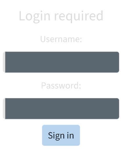
Ui::SnapLayoutColumn layout = Ui::SnapLayout::snapRoot(_ui, Ui::Snaps{});

_titleLabel = Ui::Label{layout.child(), "Login required", Ui::LabelStyle::Title};

_usernameLabel = Ui::Label{layout.child(), "Username:"};
_username = Ui::Input{layout.child({200, 0})};

_passwordLabel = Ui::Label{layout.child(), "Password:"};
_password = Ui::PasswordInput{layout.child({200, 0})};

_signIn = Ui::Button{layout.child(), "Sign in", Ui::ButtonStyle::Primary};
_signIn.onTrigger([this] {
    /* For a lack of a better idea let's just leak the password to stdout :) */
    Debug{} << "Signing in with" << _username.text() << "and" << _password.text();
});
When you build and run, the form will look like this. Beautiful, isn't it? Almost alive.
Stateful and stateless widgets
One important aspect of the Ui library is that internally only the essential data needed for drawing the UI and handling events are stored. A Ui::
A consequence of the above is that the widget classes are just a stateful interface for the application code, allowing it to access and modify widget properties. But apart from user callbacks like the lambdas passed to Ui::
As mentioned above, the default behavior is that destructing a widget class removes the widget, which is a common RAII expectation. So just turning the widget members into local variables isn't going to work. Instead, widgets support construction using the Ui::
In conclusion, from the layout we have we only need to access the _username and _password from the button trigger function. Everything else can be switched to stateless variants, i.e. along with removing the _titleLabel, _usernameLabel, _passwordLabel and _signIn members. For buttons and labels we can even use the Ui::
Ui::SnapLayoutColumn layout = Ui::SnapLayout::snapRoot(_ui, Ui::Snaps{});
Ui::label(layout.child(), "Login required", Ui::LabelStyle::Title);

Ui::label(layout.child(), "Username:");
_username = Ui::Input{layout.child({200, 0})};

Ui::label(layout.child(), "Password:");
_password = Ui::PasswordInput{layout.child({200, 0})};

Ui::button(layout.child(), "Sign in", [this] {
    …
}, Ui::ButtonStyle::Primary);
With this change, there should be no visual difference, but the code is simpler and uses slightly less memory.
Container widgets
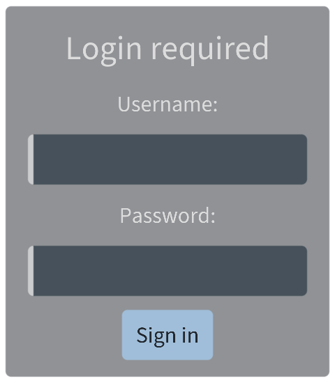
Besides leaf widgets like labels, buttons or inputs, there are container widgets, with other widgets placed inside. Let's put our form into a nice tidy Ui::layout we've made above, and form a column layout out of Ui::
Ui::Panel panel{Ui::NonOwned, Ui::SnapLayout::snapRoot(_ui, Ui::Snaps{}),
    Ui::PanelStyle::Filled};
Ui::SnapLayoutColumn layout = panel.contents();
Ui::label(layout.child(), "Login required", Ui::LabelStyle::Title);

Ui::label(layout.child(), "Username:");
_username = Ui::Input{layout.child({200, 0})};

Ui::label(layout.child(), "Password:");
_password = Ui::PasswordInput{layout.child({200, 0})};

Ui::button(layout.child(), "Sign in", [this] {
    …
}, Ui::ButtonStyle::Primary);
Another container widget is for example the Ui::
Nested layouts
Finally, the above is just a plain column layout that's wasting a lot of vertical space, and we're likely not making an iPhone UI just yet. So let's make it a bit more compact, aligning the labels next to the input fields in nested Ui::
Ui::SnapLayoutColumnRight layout = panel.contents();
Ui::label(layout.child(), "Login required", Ui::LabelStyle::Title);

Ui::SnapLayoutRow usernameLayout = layout.child();
Ui::label(usernameLayout.child(), "Username:");
_username = Ui::Input{usernameLayout.child({200, 0})};

Ui::SnapLayoutRow passwordLayout = layout.child();
Ui::label(passwordLayout.child(), "Password:");
_password = Ui::PasswordInput{passwordLayout.child({200, 0})};

Ui::button(layout.child(), "Sign in", [this] {
    …
}, Ui::ButtonStyle::Primary);
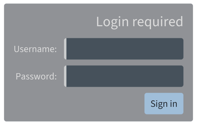
The theme and layout algorithm again makes sure everything is evenly spaced and lined up. For simplicity we aligned everything to the right by switching the layout to Ui::200 units wide as well to center them relative to the input fields.
And now what?
The above guided you through the initial setup for a user interface and explained essential concepts and workflows with the library. More UI tutorials are being written, for now feel free to dig deeper:
- The Ui::
AbstractUserInterface documentation has a more detailed description of the application setup as well as all underlying concepts that power the library - The Ui::
AbstractWidget class describes relation between widgets, anchors and nodes, and expands on the concept of stateful and stateless widgets and ownership - Capabilities of the builtin layout engine are described in the Ui::
SnapLayouter class docs, along with the high-level interfaces used for widget placement - Everything else, including a list of builtin widgets is accessible from the Ui namespace docs